Inspirations/Materials
Materials · 6 min read
Paint: why the same shade looks different in your house
A colour chosen in a showroom is a colour chosen under the wrong light.
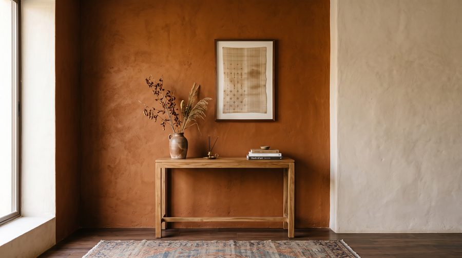
Paint has no fixed appearance. It reflects whatever light falls on it, and a north-facing room in Delhi, a west-facing room in Chennai and a fluorescent-lit showroom are three different lights. The only reliable method is to put a large patch on the actual wall and look at it at three times of day before committing.
Sheen matters as much as colour and gets far less attention. Matt hides an uneven wall and marks easily. Satin and eggshell wipe clean and are the sensible choice for a corridor, a child's room or anywhere with hands. High gloss shows every flaw in the substrate underneath and should be reserved for surfaces that deserve the scrutiny.
Undertone is what makes a neutral go wrong. A grey with a green undertone next to a grey with a violet one will look like a mistake even though both are grey. Compare candidates against each other, not against white paper, which makes everything look muddy.
Budget for preparation rather than for a premium product on a poor surface. Two coats of a mid-range paint over properly filled, sanded and primed walls will outlast and outlook the reverse.
Budget for preparation rather than for a premium product on a poor surface.